Many businesses are trying to make a small change in their brand identity, which is a change in the font. Maybe it is to connect to their younger audiences or to make the typeface look clean, subtle and simple. When developing a brand identity, it’s important to make sure that everything about your company reflects that identity, from the company colours and logo right down to the fonts chosen for all the content across their brand. All are familiar with the idea of visual branding with logos and colors. And while most consumers on a day-to-day basis don’t notice fonts, a switch in font can completely change the look and feel of a brand.
Many consumers nowadays view content on their smartphones, laptops, tablets and other devices, so it is necessary that he/she does not have any difficulty in reading it on any screen size. The font needs to be clean and clear to read as people use these devices while they are travelling. Thus selecting the right font to work across all your communications is very important. As certain colours evoke certain feelings when seeing a specific colour, in the similar manner certain fonts also evoke certain emotions like BOLD can mean strong or show strength while a LIGHT can mean sleek or modern at the same time.
Certain font families do not include regional languages making it difficult for their fonts to look consistent. Sometimes the best solution to this is to develop a custom font for the brand. Designers have always believed that having a custom font for the company is a big part of the corporate identity. It can effectively communicate the ethos, attitudes and personality. A simple change from a thick blocky font to a sleeker more modern font can jump a logo from boring to interesting and progressive in no time.
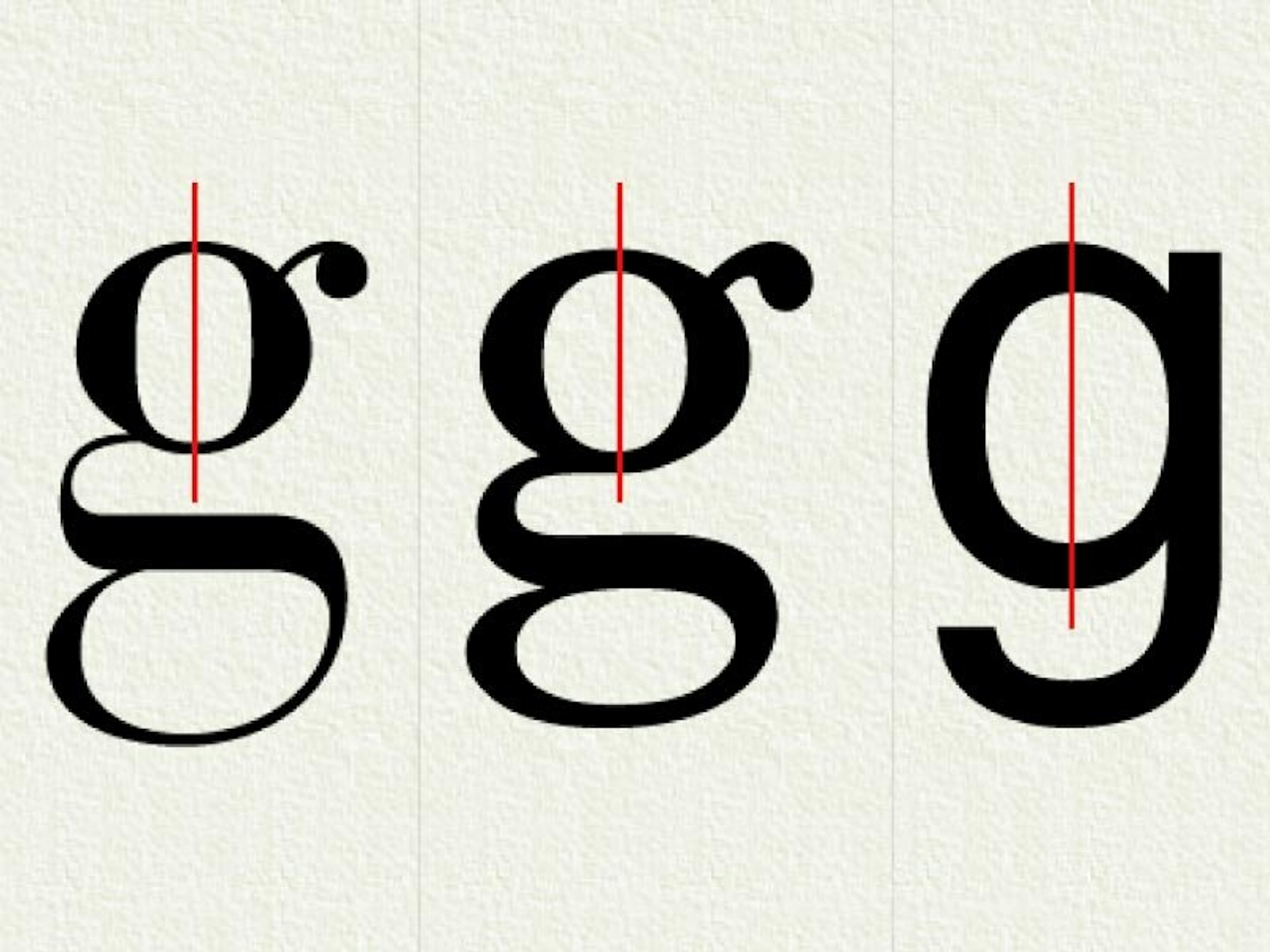
The two biggest categories of fonts are the Serif and San Serif. A serif is a small line attached to the end of a stroke in a letter or symbol. A lot of Serif typefaces that you see will look a lot more traditional or conservative.
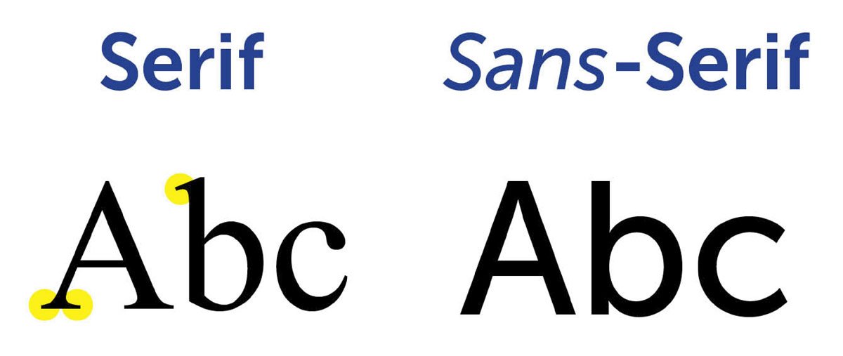
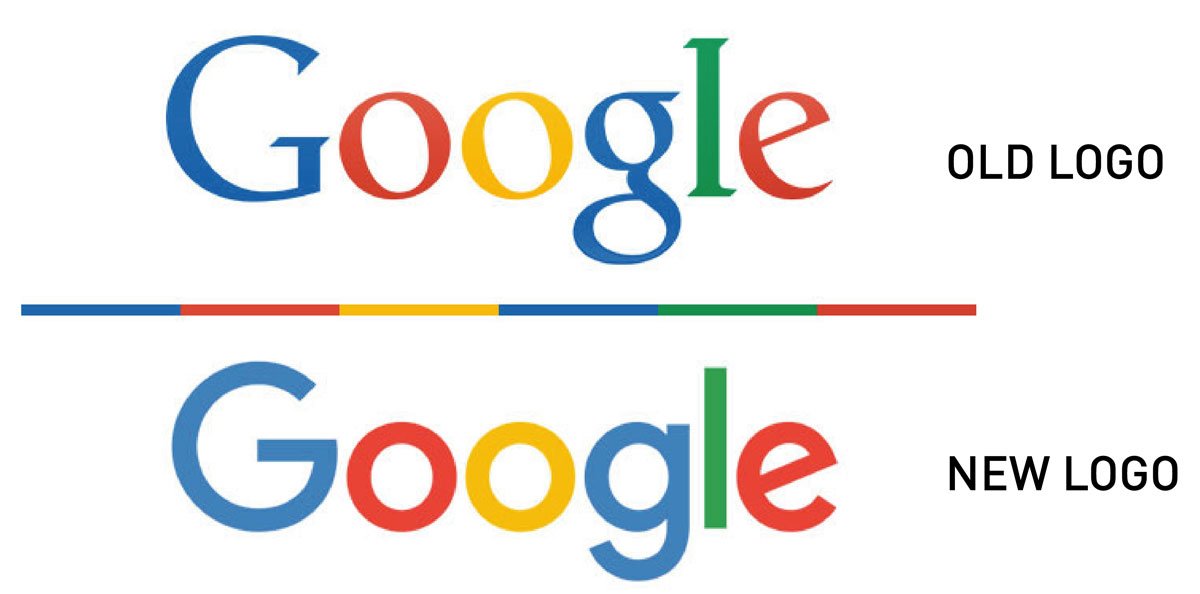
Sans Serif, simply means a typeface without the serif, they also have more evenly distributed thickness throughout the text. Sans Serif is considered to be a font type of the new generation; it has been considered to emphasize youth, a minimalist nature, and being current and fashionable. A lot of brands are currently moving to san serif to look more minimal, connect to younger generation and modern. Biggest example of this is Google.
Last year, Google changed their logo to introduce a more fun and engaging feel to the brand. Many did not notice the technical change for a while, but did feel the effects that the new text created without being able to pin point what exactly.
The font is an extension of your brand. Typefaces have to be chosen very carefully as it will be used across all your digital mediums. Legibility, readability and being memorable are some of the prime factors for a brand’s typeface. Creating a font is a better option as it saves millions from licensing costs as well as it helps to maintain a certain uniformity across all mediums of communication. It also creates an ownable and unique element for brand’s aesthetics.
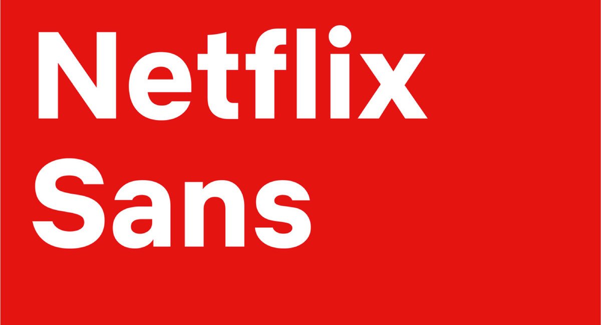
Netflix recently unveiled its new font known as Netflix sans. Again, san serif to serve for both display and functional purposes. Changing the font does not mean doing something drastically different, just making the font more clean, functional – as in making it easier to read across all digital mediums. In recent times other brands have also created their own font such as Intel, Nokia and General Electric, among few others.