Atoot
Brand Essence
Verbal Identity
Visual Identity
Brand Communication
Establishing a Distinctive Brand for an NGO Focused on Empowering Girls in Underserved Regions
The Challenge
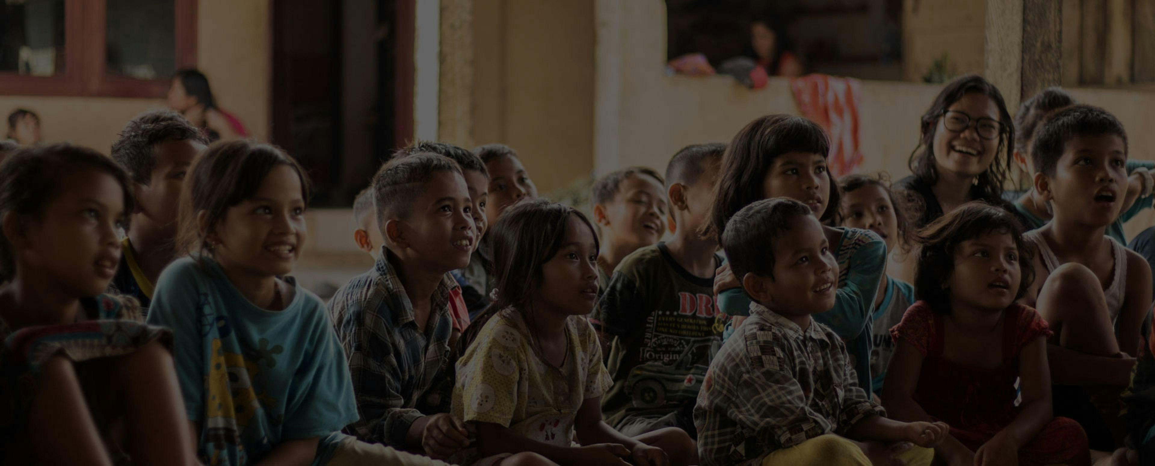
Atoot, a registered non-profit organisation operating in the USA and the Kapilvastu district of Nepal, actively addresses critical challenges within the region. Notably, the district grapples with a high incidence of child marriages, particularly among girls aged 10 to 19- surpassing the national average at 62%. Despite this, Kapilvastu boasts a substantial youth population, with nearly 50% under the age of 20, exceeding the national average by 10%.
Atoot has strategically concentrated its efforts on empowering girls through sports academia, recognising the transformative potential of Education and Physical activities. Acknowledging the importance of a robust brand identity, Atoot aims to attract investors, engage organisations in Corporate Social Responsibility (CSR) initiatives, and secure government contracts. Atoot partnered with ABND to craft a brand that communicated credibility, innovation, and a steadfast commitment to social change. This would ultimately enhance Atoot’s impact and influence, fostering positive development not only in Kapilvastu but also extending its reach beyond.
Our Approach
ABND conducted:
- In-depth immersion sessions with the Founders to comprehend the Organisation’s vision, impact and aspirations.
- Evaluation of testimonials from students and families who have experienced positive outcomes through Atoot's programs.
- Thorough category analysis conducted through desk research.
The Solution
In establishing the foundation for the Atoot brand, we acknowledged the fact that in the Education or Non-profit industry, there didn’t exist a narrative that didn’t sound comforting or noble. It, thus, became all the more crucial for Atoot to thoroughly explore the core of their mission, seeking to uncover the intrinsic motivations that set them apart.
ABND identified two pivotal factors crucial to Atoot's differentiation:
Localisation:
Atoot closely collaborated with communities to discern their distinctive needs, tailoring their programs to precisely meet those requirements.
Long-term Impact:
The emphasis on localisation also ensured sustained impact. Atoot committed to working with communities over an extended duration- ensuring the efficacy, sustainability and a cyclical trajectory for their projects.
In accordance with these guiding principles, Atoot's core purpose materialised as "Atoot in Mindset. Atoot in Community." It went beyond fostering an unyielding mindset; it encapsulated the commitment to empower girls in regions with limited opportunities. Atoot aspired to cultivate a community where girls not only flourish but also evolve into influential role models for others.
Brand Personality:
Transforming into the embodiment of a “Caregiver” archetype, Atoot's brand personality materialised as a provider of secure environments, a guarantor of lasting impact and a nurturer of a thriving ecosystem. Consequently, the communication tone was meticulously drafted to exude empathy, compassion and a profound understanding of the challenges confronting the community.
Emotional Connection
Using storytelling and real-life example to show how our services can make a meaningful difference
"We are girls.
How can we play?"
Practical Support
Communicating expertise and knowledge in this area, positioning ourselfs as a trusted sources of information and support
Creating safe havens in unchartered territory
Advocacy
Raising awareness of the challenges girls face and push for policies and programs that support them
More Then Just a Game: Building Bridges and Breaking Barriers
From the Field to the Future: Empowering Youth Through Sports and Education
Brand Identity:
In navigating the dynamic landscape of not-for-profit branding, the thoughtful selection of colours for Atoot demonstrates a strategic approach. The distinctive Thriving Coral and Unbreakable Blue were intentionally chosen to encapsulate the essence of Atoot's mission. Thriving Coral, a rare choice within the industry, serves as a symbolic representation of success, approachability and a harmonious fusion of the dynamism of Red and the optimism of Yellow.
Conversely, Unbreakable Blue conveys essential qualities such as trust, strength, purity and transparency—attributes synonymous with the core values of Atoot.
The visual identity of Atoot draws inspiration from the resilient dandelion, symbolising the Atoot community that carry an unwavering commitment with them, regardless of their individual journeys.


Client
Testimonial
“Working with ABND was a revelation. They facilitated an equal learning and knowledge-sharing relationship with our small, grassroots non-profit to bring our Brand Identity to life. In a world which emulates power as strength, the team guided our working relationship with empathy, compassion and kindness. This type of solidarity is what makes our world succeed and grow.”
Sarah Van Vooren
Co-Founder & Executive Director, Atoot
Other Projects

FLAME university
Building India's Pioneers in Liberal Education through a Decade of Partnership

Dr. Polaris
Transforming Medical Education through innovative EdTech Solutions

Vidyashilp
Vidyashilp Lorem ipsum dolor sit amet consectetur adipisicing elit. Nulla ad laudantium id maiores ipsam beatae pariatur?
All Work
Consulting
Engineering & Manufacturing
GMM Pfaudler
Precision Electricals
Evonith
Precision Pipes & Fittings
Pressfit Profiles
Norsmiths
Alok Textiles
Fashion & Lifestyle
IT & Technology
Logistics
Construction & Real Estate
Bharat Realty
Mehta Group
Om Landmarc
Rachanaa Group
Beautex
Royalti
Education
FLAME University
Vidyashilp University
The Academic City
Dr Polaris
K. K. Wagh Education Society
IRMRI
Birla International Schools
Shloka
Tenneo
Atoot