What?
Sharpening my skills as a brand practitioner over the last decade in India and abroad, has given me many stories and experiences. Among them are those from the time when I was left, right and center scouting and engaging with brands across the globe that could do with, well, a new ‘logo’ so to say. Of course, I wanted to talk about long term brand building. But getting in the door with something worth its meat was the first hurdle. A response was…o la la la…a homerun. So, while it wasn’t all honkey-dory, my partner and I, were sending out proposals, solicited and unsolicited, and relentlessly. They included a bank in an island nation, a TV station in Nigeria, a university in Bihar in India, a port, a global association in the Netherlands and even a city in America, and * reveal drumroll* an Olympic game as well. This series is to share a few of those stories, learnings and of course, the work. I will also add trivia, facts and opinions so that it is an enriching read.
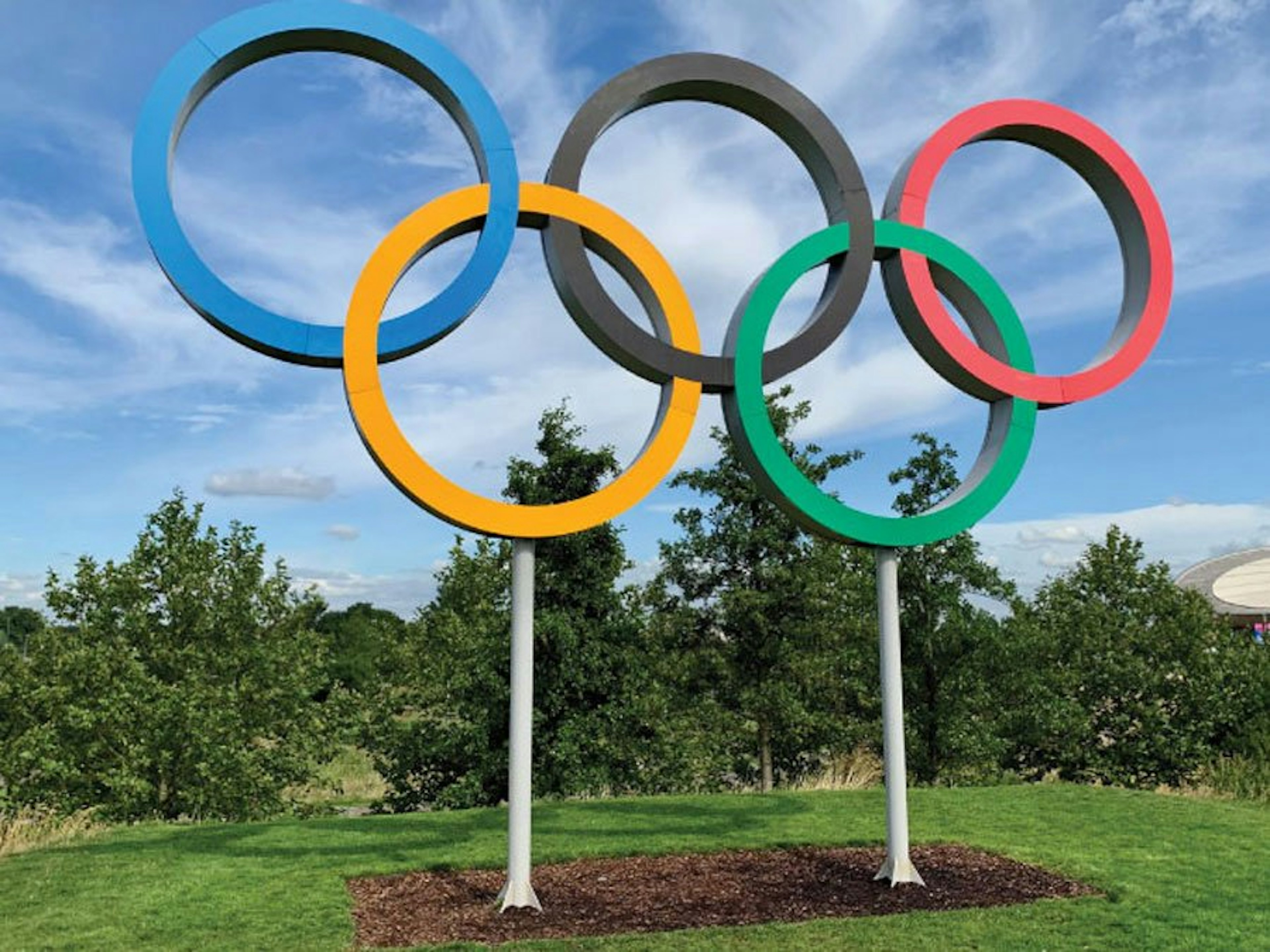
Let the games begin
Amid an emergency declared in the city of Tokyo due to the pandemic, there is a rising public sentiment against the city hosting the previously deferred 2020 Olympic games this year. Simultaneously, the 2022 Beijing Winter Olympics is also staring at a possible boycott in a diplomatic call made by Nancy Pelosi against China.
Mention of both the games stir me up, both as a Brand Practitioner and personally.
The Tokyo Games
On a personal front, I was to witness the Tokyo games as my first Olympic. I had booked my tickets and the excitement was palpable to all whom I spoke of it to. Of course, this was before Covid-19 became full-blown and rendered the Olympic as a pipedream for me.
Its fate is uncertain as of now with contradictory statements and stands.
But then the 2020 Tokyo Olympic games have faced other unfortunate events in the past. The most notable was the logo plagiarism controversy that plagued it. Kenjiro Sano, the designer of the original logo was pinned by Belgium’s Théâtre de Liège emblem. Such highprofile assignments, of course, have always faced controversies time and again.
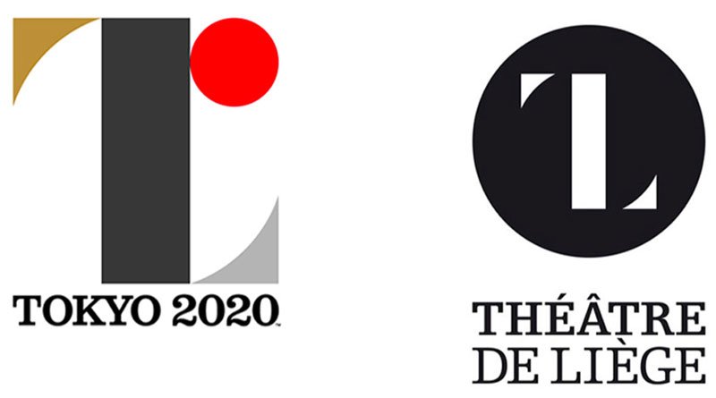
The original Tokyo games logo and the Theatre De Liege Logo
There can debates about the above comparisons. Some may say that ‘designs done simply using basic geometric shapes can appear similar’. Other may question the ‘uncanny similarity’.
Finally, a new chequered-style logo was adopted. It is a pattern inspired from the Japanese Edo period. Notably, it tries to cash in on the popularity and familiarity of chequred patterns countries across the world throughout history.
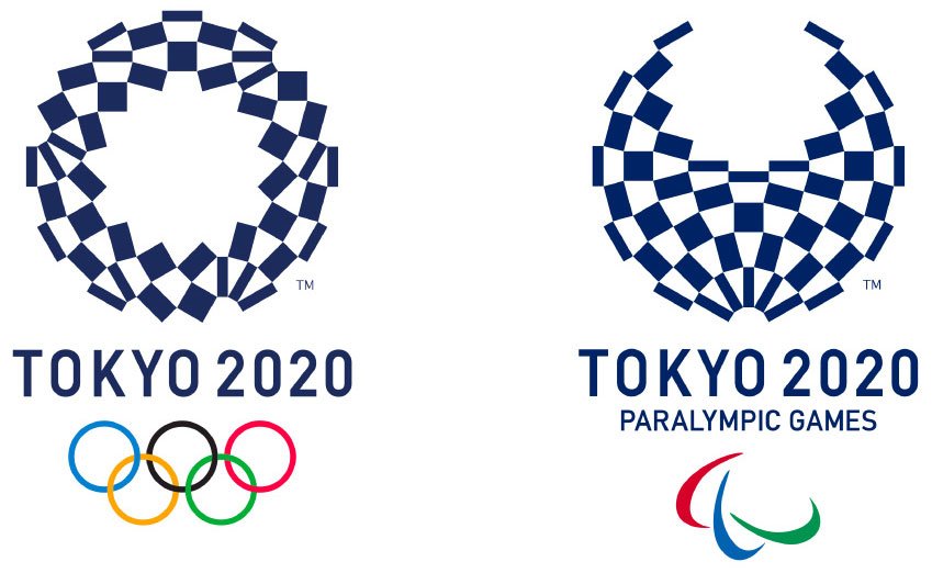
The official Tokyo 2020 games logo
Narration
Three different rectangular shapes represent diversity.
Diversity makes the world a vibrant place.
It sets us apart but can bring us together.
With mutual respect and support, diversity becomes unity.
These two emblems are made of the same number of shapes.
They remind us that all people are equal.
That regardless of ability or disability, we are united in our humanity.
The thrill and excitement of sports inspires us and makes
hearts around the world beat together as one.
This is where a dazzling future begins.
Interestingly, an unofficial logo, created by designer Daren Newman, went viral during the time. It was praised for ‘elegantly capturing the spirit of the games and the Japanese city’ according to a news reports.
The report further said that the logo “…design plays with the shapes of the Olympic rings and makes them read ‘2020’. It also fills in the red ring to make it look like the rising sun disc found on Japan’s flag.”
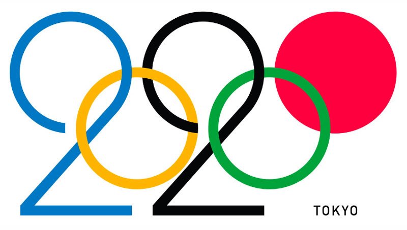
The unofficial rendition by Daren Newman
However, as striking and relatable as the logo may be, it has fundamental problems. It does not adhere to foundational guidelines. It conveniently forgets that the Olympic games is a brand too, and its identity too has usage guidelines. The rings are identifiers that cannot be played with – distorted, recrafted or filled with color as seen in the concept. So, there imagination may be beautiful, but from a brand perspective it is a ‘royal fail’. More so, compared to the current logo with Edo period connect that evokes curiosity and allows for extending brand Japan’s image beyond the mere ‘rising sun’, the unofficial logo is at best a ‘work of art’. A brand logo can, and ideally should try to, optimally take more load beyond mere beauty.
The Bejing games
It was around the end of 2016. The importance of Olympic game logo usage guidelines became clear when the international call for creating the design emblem for the Olympic and Paralympic Winter Games Beijing 2022 was announced. I am not sure, if I had read about it at that time or later – but it was a unique coincidence that was to take place. China was to become the first country to host both the summer and winter Olympics in 2022. I think that is also when I realized the concept of summer and winter games. I also realized that along with the logo of the main games, the logo design also needs to account for the Paralympic games.
Coming back to the Beijing games, I was sitting in Africa and my mate in India. We felt such a turbulence of emotions gripping us when we saw the submission documents. Yes, there was the world to read. The language was not understandable at first go. There were questions we had but did not really know how to answer them.
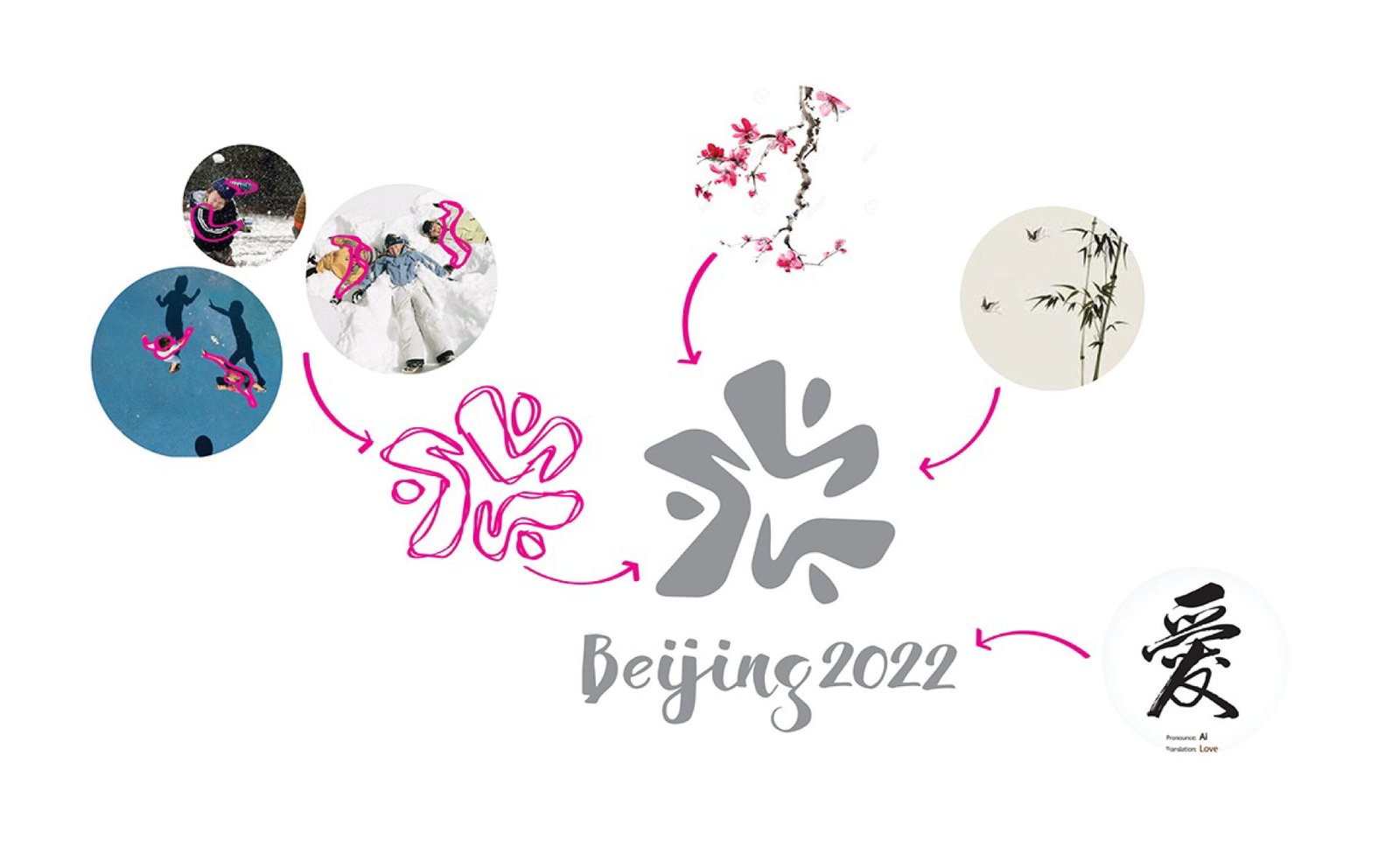
Nonetheless, sleepless nights were spent over crafting a proposal that we are proud of. Like some of the titles of concepts considered for the current Tokyo games identity, like ‘Connecting Circle, Expanding Harmony’, ‘Surpassing One’s Personal Best’ and ‘Flowering of Emotions’ among other, we called our concept ‘The Pure Play Flower’. It was inspired by a combined inspiration of kids playing without inhibition in snow in the spirit of playing and the plum blossoms representing the Chinese winters.
Our logo is best described by a line from a Chinese poem, “…the fragrance of plum blossom comes from bitterness and coldness…” synonymous to the sporting souls that are tempered through the sufferings. The pure play flower celebrates their growth of inner strength and unbending spirit.
The following narrative was written (in line with narration of the Tokyo games above):
Winning or losing doesn’t make memories.
Living through the winter on the games field does.
It’s where the players leave their mark for eternity.
For the winter is harsh but spirits have survived.
Nations have been made proud.
Hearts have come together.
The ice may melt. Memories never will.
The snow will return to create new memories.
Old ones will fondly smile beneath etched in ice forever.
The PURE PLAY FLOWER will live forever.
The human spirit will be intact forever.
The Olympics and Paralympics will bloom over and over again.
It is all about PURE PLAY.
Following is the visual rendition of the work:
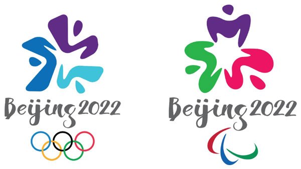
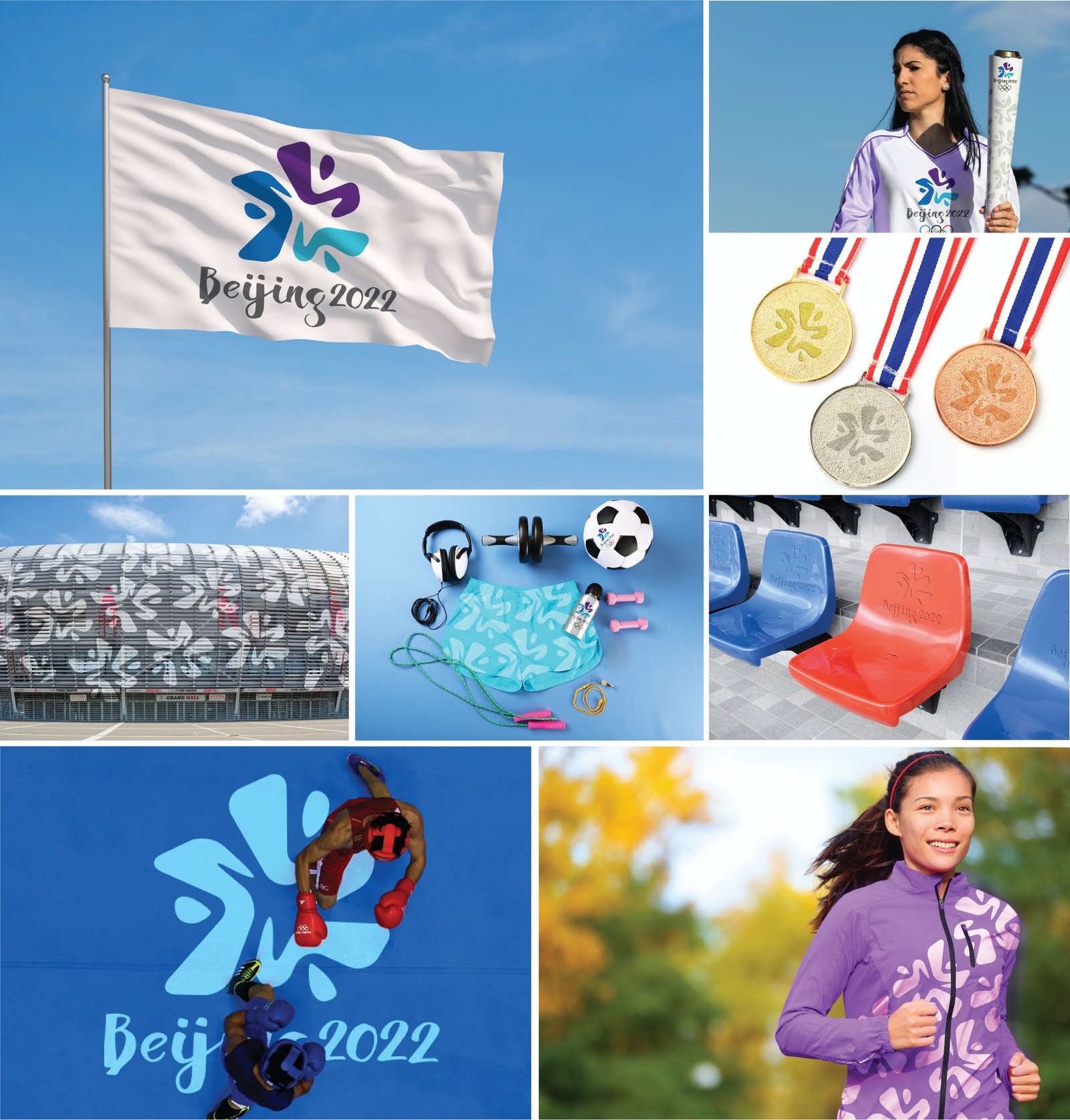
Proposed identities
Did we win?
No. We didn’t.
Chinese graphic designer Lin Cunzhen – then an Associate Professor at the China Central Academy of Fine Arts did. Interestingly, she was also co-designing the logo for the Nanjing 2014 Youth Olympic Games. And now, she works for the Culture and Ceremonies Department of the Beijing 2022 organizing committee. (Are you smirking? We did too.)
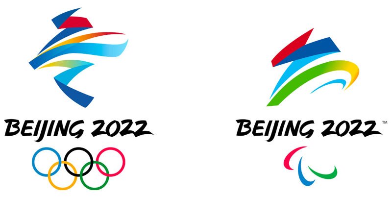
The winning work
About the work: The work is named “Winter Dream”. The emblem is inspired by 冬, the Chinese character for “winter”. A statement from the Beijing Organising Committee (BOCOG) says – “The ribbon-like motif in between, full of rhythm, stands for the host country’s rolling mountains, Games venues, ski courses and skating tracks. The ribbons, as artistically expressed in the emblem, give a touch of festivity and are an indication that the Games coincide with the celebrations of the Chinese New Year.” The statement further says, “The Paralympics logo, meanwhile, is based on 飞, the Chinese character for “fly”, and is styled to evoke the image of an athlete in a wheelchair “rushing towards the finish line and victory.”
In conclusion
Creating the Olympic proposal was an immersive experience. Not only the concepting or design, the learning, and the process to submit work for such initiatives remains for a lifetime. There is a sense of confidence that carries one forward. Not to forget how we come to appreciate culture. And because you take that one step to expose yourself, new knowledge seamlessly unfolds before you. The correlations, the way today when we see the Tokyo games work vis-à-vis our work gives perspectives and last, but not the least, brings a smile. It feels that at least one has tried.
As a brand practitioner – who does not believe in the divide between strategy and design – I can only say that as professionals on should jump on to opportunities. Reach out. The world is connected more than ever. Grow. The choice is yours. Try it. If you have done so, great. Keep going. If not, I can only give a clarion call – ‘Let the games begin.’
P.S. We had made one big mistake then. Funnily, it is no more a mistake today. So, what had happened? While we made the logo identities then, we missed using the ‘Paralympic Games’ in our logotype. The Paralympic emblem is called ‘agitos’ in general (just like the ‘Olympic Rings’) and it contained the words. But in 2019, the International Paralympic Committee (IPC) dropped the words in the Paralympic emblem as such differentiations are not seen in its Olympic counterpart identity. In fact, the words do not appear in the Paris and Los Angeles games logo of 2024 and 2028 respectively. Also, the Beijing games altered the Paralympic logo accordingly. But hey, inadvertently, it was us who got it right the first time. Hahaha! That’s on a lighter note.
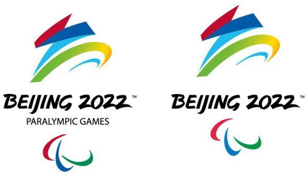
The Original (L) and the Revised (R) versions


