“And that mask, it’s not to hide who I am, but to create what I am.”
What if I told you that a single brand has used more than 40 different types of logos over the last 80 years? Or multiple different logos within the same year? Any global brand with a legacy like that would never change their identity more than 8 to 10 times in its lifetime. To any brand practitioner that comes across way too many identity changes in a brand; it will reflect inconsistency and confusion which will surely affect its position in the marketplace.
Now, what if I told you that this logo inconsistency has not affected the brand at all. On the contrary, its consumer base has grown over the years, sales have hit the ceiling and judging by the popularity of this brand across the world, I have no doubt it was rated one of the greatest in its league.
I am talking about Batman. Rated No. 2 as the greatest comic-book character by Empire Magazine and IGN (second to only Superman in both cases), and No.1 in my personal favourites. I cannot think of any other superhero or any other brand that has so many versions of their logo, and yet each of it serves a purpose without diluting or damaging the brand.
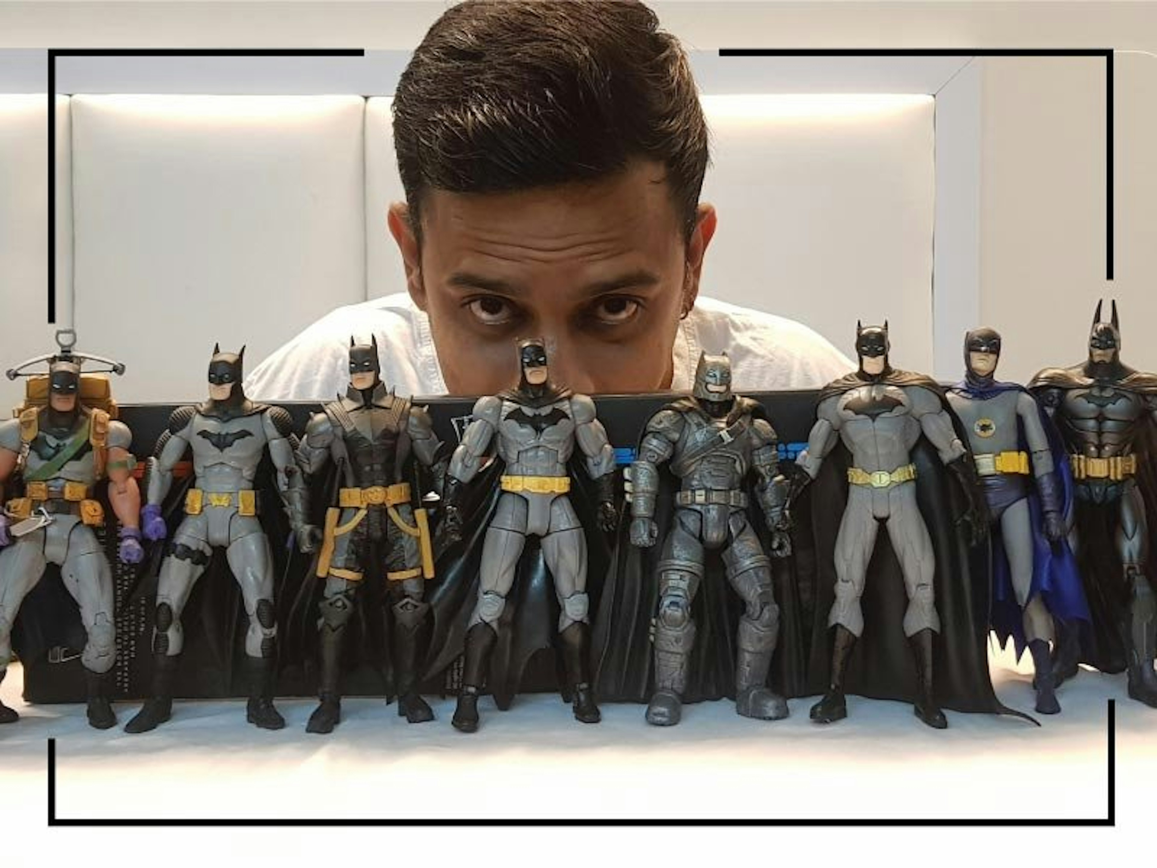
I think I was 6 years old when I was first introduced to Batman. Somebody had gifted me this really cool action figure of a guy in a mask and cape with a huge bat on his chest. It meant the world to me. Little did I know this was the starting point that took me into the ever intriguing world of the dark knight. I grew up reading Batman comics, watching not just the Adam West version of Batman but also Tim Burton’s Batman movies (sadly also including the forgettable Joel Schumacher ones). As an adult, I continue to remain a fan boy of the Christopher Nolan Batman Trilogy and all Frank Miller’s Batman works.
While a lot has been written about connecting Batman to branding and philosophy, I’d want to focus this article on the Batman logo, one of my favorite logo, or should I say “logos”.
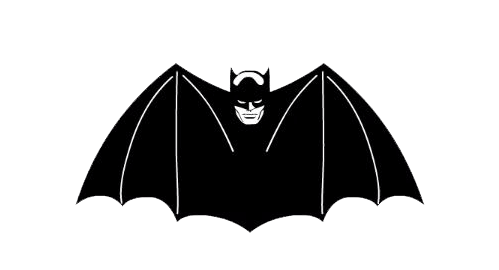
When I say “Batman logo”, I’d assume most people would get the image of a bat icon spreading the wings out on the yellow background, and rounding the edges to perfectly fit the oval. This is by far the most iconic and recognizable version of Batman logo which was introduced around 1966 (almost 30 years after Batman’s debut). However, by around 1995 this logo was no longer in use. The comic book and the movie version of Batman post 1995 have dropped the yellow oval and used variants of the logo without the oval casing.
The beauty about Batman is that every writer, artist and filmmaker created their own version of Batman. With the characteristics and personality of each Batman, the logo changed. Bob Kane’s 1939 debut of Batman saw a simple small black bat painted on his grey costume. The 1946 logo was the one that closest resembled the symbol that became most known in the mid-’60s. Here we have a more standard shape featuring five points below the wings. The yellow oval was first introduced in 1964, later made popular by Adam West playing Batman on-screen. The yellow casing made the logo prominent. I believe this was a brilliant move from a merchandising point-of-view, as it said Batman, without actually showing Batman. The 1989 and 1992 versions of on-screen Batman played by Michael Keaton had the iconic oval, however this time it was not painted, instead it was a 3D-ish logo that held the cape. That’s the last time we saw the yellow-casing on-screen. The Joel Schumacher and Christopher Nolan versions of Batman saw him shedding the yellow oval in favor of a sleek, charcoal design. This in turn inspired similar armor-esque designs all the way up to Christopher Nolan’s Dark Knight Trilogy. Interestingly, Zack Snyder in his 2016 Batman V Superman chose the Batman logo and look inspired from Frank Miller’s Dark Knight Returns comics, a weathered and jaded version which had passed his prime.
Besides these few examples that I have mentioned above, there are numerous versions of Batman logos over the last 80 years. Every logo and look of Batman defined his character and served a purpose for a specific audience. The Batman from the animated series meant for children, wears lighter colours and has a friendlier logo while the Batman meant for matured readers is darker, grittier and wears a logo that reflects the same. If Adam West wore a yellow logo it was because the on-screen Batman in the 60’s was fun and colourful as opposed to Christian Bale’s cleaner and sharper version of the logo that reflects his agility and use of technology to fight crime. In spite of so many versions (or inconsistencies), the Batman brand is growing every year. Even after nearly 80 years, Batman comics still rank among the top sold today—appearing in 6 of the top 10 comics sales this past January (including 1 to 4).
Batman represents the pinnacle of human performance. There is nothing supernatural about his abilities. He is human with powers that seem within reach. While every superhero can say “with great powers comes great responsibility”, Batman cannot. For Batman it is the purpose that defines him, with purpose comes power. In case of Batman as a brand, the logos change, the costumes change, gadgets change and enemies change but his purpose does not. Be it the fun colourful animated version or the dark and grittier version – his goal remains constant. No matter what he wears Batman always was and always will be a vigilante detective!
Like every successful brand Batman knows his audience. He studies criminals and always has a plan. Batman thinks of everything and plans for anything. Like every good brand, Batman is built upon a foundation of valuable resources and assets. His training, his gadgets and his technology are essential to his crime fighting. Your brand is more than the individuals who envisioned it. Bruce Wayne did more than put on a suit and fight crime. He also created a symbol, something that could exist beyond his own limitations and inspire a city in ways a single man could not. These are all traits of a successful brand, no matter what the logo.
As a brand practitioner I go around advising clients to maintain consistency with their visual identity – Batman defies that logic but at the same time Batman also resonates the one thing I tell all my clients “your brand is not just your logo” – it is your purpose.
Brands should aspire to become like Batman. No matter what version of logo you put on him, he will always be Batman.


