“You eat with your eyes first”. If you are a Masterchef fan, you may have often heard Gary Mehigen or Matt Preston repeat this over and again to their contestants, with due emphasis on their plating. While the variety and taste of the food is a major deciding factor, the visual appeal of a dish plays an important role in deciding whether an individual is attracted towards it or not. In recent times, fine dining restaurants with clean and elegant plating have witnessed a surge in customers. They are boosted not only through word of mouth, but through social media as well. However, it is not just the food and its plating that catches our eye, but the brand too. Fine dining restaurants have the experience and the looks to fall back upon. But how do fast food joints continue to grow in this market?
Let’s take the brand Burger King for reference:


From the above two options, which sign would attract you the most while driving past a highway or an expressway? Most people would select the first option, and rightly so. Fast food brands stay relevant and continue to grow in this industry due to their colours. In spite of changing trends of more health conscious individuals, fast food brands have not seen a drop in their sales. Apart from the affordable pricing and convenience, customers are attracted towards fast food brands because of their brand identity. According to human psychology, colour has a huge role in defining human emotions and behaviour.
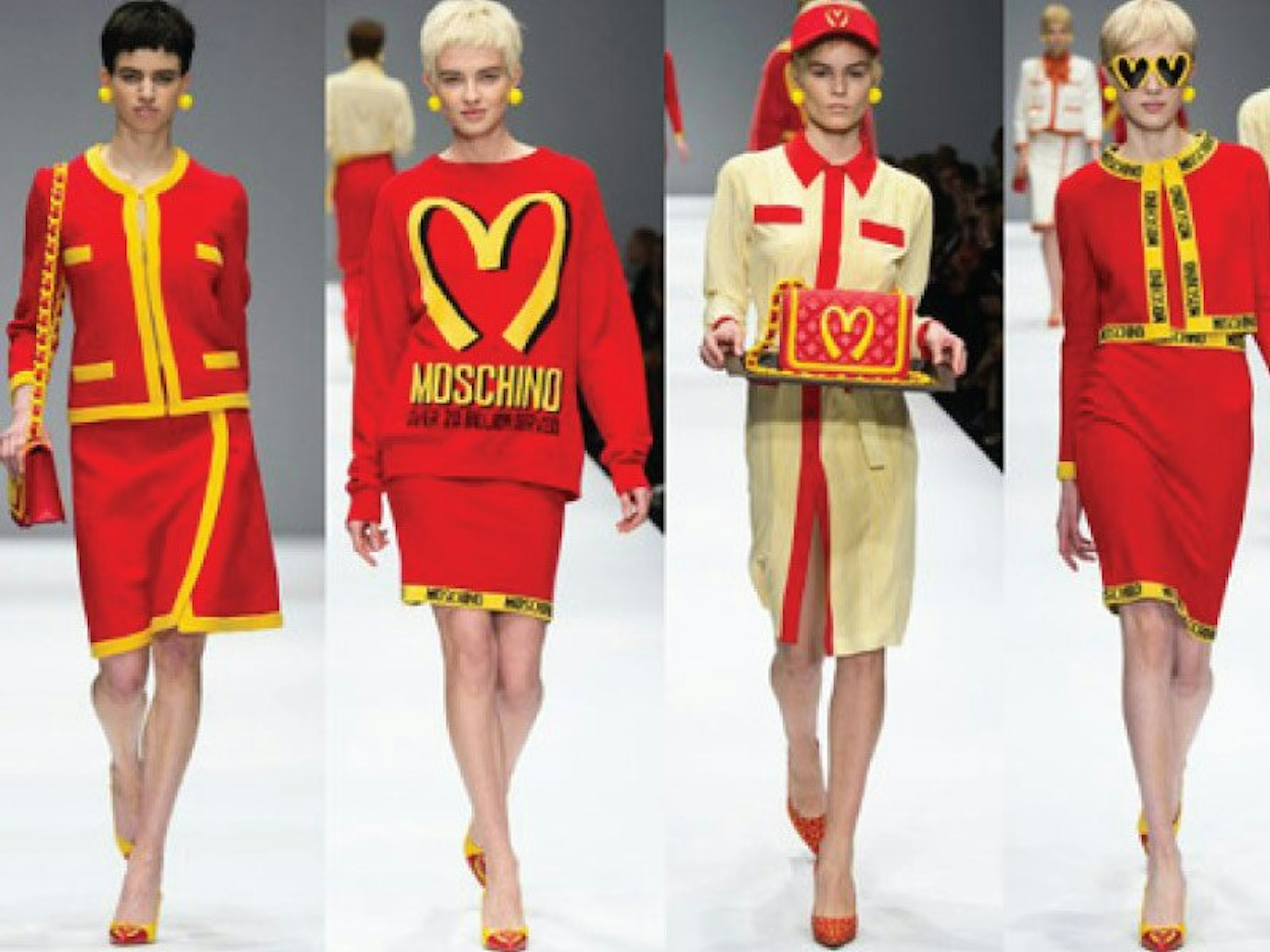
Let’s think about popular brands like KFC, Mc Donalds, Wendy’s and In N Out. What is the most common thing that stands out amongst these brands? It is the two colours, Red and Yellow. When you order for French fries or a Hot Dog, what is the one thing that you ask for along with the meal? It’s ketchup and mustard sauce. This gave rise to a popular theory known as the “Ketchup and Mustard theory”. Based on this theory, fast food brands are often seen to use these two dominant colours across their logos and advertisements.

Red is one of the most common and effective colour used in fast food brands. An average human can see up to 10 million colours, but Red is the most chosen. Red is unique as it ages back to the days when it was the first colour to ever be named by our ancestors. Scientifically, red is known to stimulate your senses, making an individual energetic and excited. This colour is also associated to meat and sauces, two of the most mouth-watering offerings of fast food joints. Red is the fastest mode of communication to our brain. It makes us feel loved, warm and comfortable, which is exactly what one expects from a filling meal.

In contrast to red, yellow is the symbol of happiness, youthfulness and cheer. When used along with red, it not only acts as a source of vibrancy, but also adds an uplifting feel. A person ordering from Hardees is most likely to order for a group of friends or family, coming together to share their emotions of hunger, excitement and happiness. While yellow is often used as a secondary colour in fast food brands, some prefer to use it individually which reflects a feeling of uneasiness. These joints are seen to emphasize on the yellow by painting the walls or using yellow furniture. Fast food joints are also known as Quick Service Restaurants or QSR’s. Their basic nature is to ensure a quick turnaround time, due to which the sole use of yellow may be beneficial. However, joints which prefer customers to hangout on their premises refrain from making yellow a dominant colour.
Most often, our attraction towards the colours red and yellow stems for any pleasant memory that we may associate with the colour. For e.g.: if you remember your childhood memories of your parents taking you to Mc Donalds and giving you a Happy Meal, you are most likely to remain attracted to most fast food brands with these colours.
Michelle Obama rightly says, “Fun stuff becomes a habit, and fast food becomes a daily meal.” If you are out and starving and looking for a quick bite, would you choose a Salad Bar or a Burger King? Fast food brands know their brand essence and play on it to the fullest.
Imagine if Mc Donalds was Pink, Green or Blue, would you have the same feeling?
References: Anderson, D., & Bowman, J. (2018, May 16). Why so many fast food logos are red. Retrieved from Business Insider: https://www.businessinsider.in/Why-so-many-fast-food-logos-are-red/articleshow/64192516.cms


