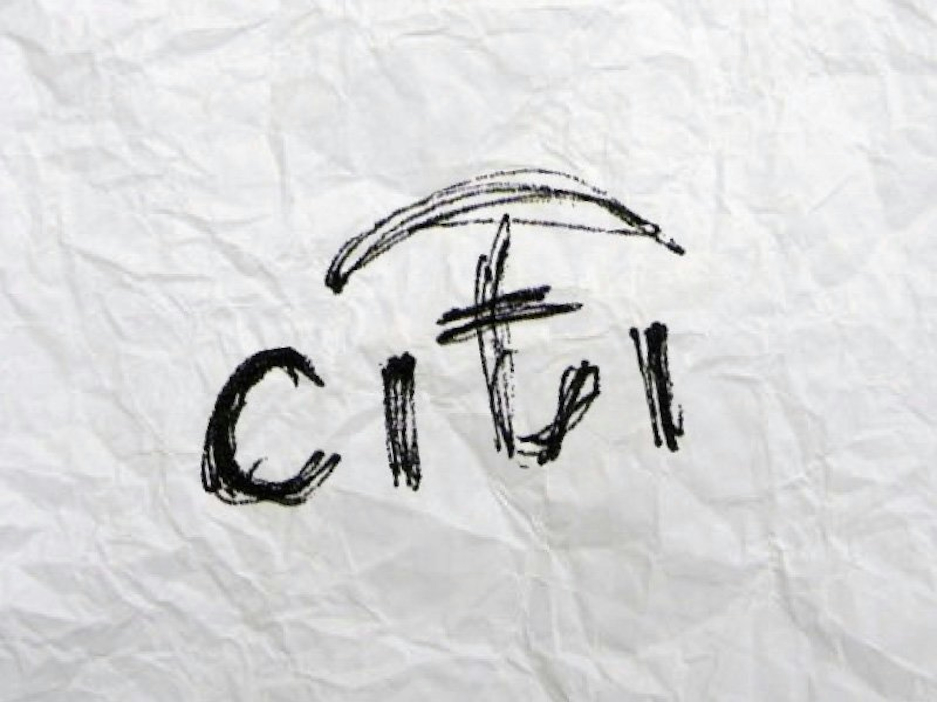
A particularly memorable logo which remains to be hailed as one of the most talked about and critically acclaimed in the industry, is one which was doodled on a paper napkin by Paula Scher, partner at Pentagram, in only a few seconds!
In 1998 there was a mammoth of a merger between Citicorp and the Travellers group leading to the emergence of a brand that became the provider of the most diverse range of financial products. The consumer division of Citigroup is commonly known as Citibank and with this noteworthy merger Citibank needed a new brand identity.
Looking back, at the very first client briefing meeting, Paula Scher had idly doodled an arch over the letter ‘t’ of citi, making an umbrella with the arch and the inverted ‘t’ to signify the traveller’s oft-used resource, the umbrella. It still took six months to work on the strategy and positioning behind it but it developed on what emerged at the nascent stage, a mere sketch on a paper napkin!
From a design point of view this logo can be debatable and it is not a unique concept, but once you see it as a brand, it is brilliant. When you hear the story of how it was created, you are inspired by the wonders of an established expertise, creativity and most importantly, years of consistent learning and experience in branding. The reason why this logo is a favourite, because of the story behind it. The question that comes to the mind is that how can an organization like Citibank base their identity on something that was done in a few seconds? What is the validation behind asking for such a heavy sum of $1.5m for a casual sketch done in five seconds? Paula’s answer is what inspires us- “It’s seconds done in 34 years.”
Paula Scher’s work has fascinated me since long, mainly because she is able to bridge the gap between strategy and design, pop culture and fine art and is thus one of the most influential graphic designers in the world. In creating the identity of Citibank she lives true to her own identity of being the ‘master conjurer of the instantly familiar.’


