India's most underestimatededucation path, arriving with a return no degree could match
Edunoia
Education
To view the full Case study, get in touch with us.
COMPLEXITY
Beyond Odds Technologies set out to build a new institute inside one of India's most undervalued education segments: skill based, vocational training aimed at producing what the founders called leaders and changemakers, not just certificate holders. The ambition ran against the grain of the category it was entering. Vocational education in India has long read as the fallback for students who could not secure a traditional degree, discounting the graduate and the credential regardless of the employment outcome that followed. Beyond Odds needed a brand that could sit inside this stigmatised category and still be trusted, simultaneously, by prospective students, their families, industry recruiters, and investors, none of whom were reading the same signals. Without a name, a language, or a position of its own, the business had no way to make its founding conviction that skill based learning could be a faster, more dignified route to economic independence.
CLARITY
The clarity ABND found sat in a distinction the business had already made in principle but never converted into language: this was not education sold as an experience, but education understood as an investment, with an expected, measurable return.
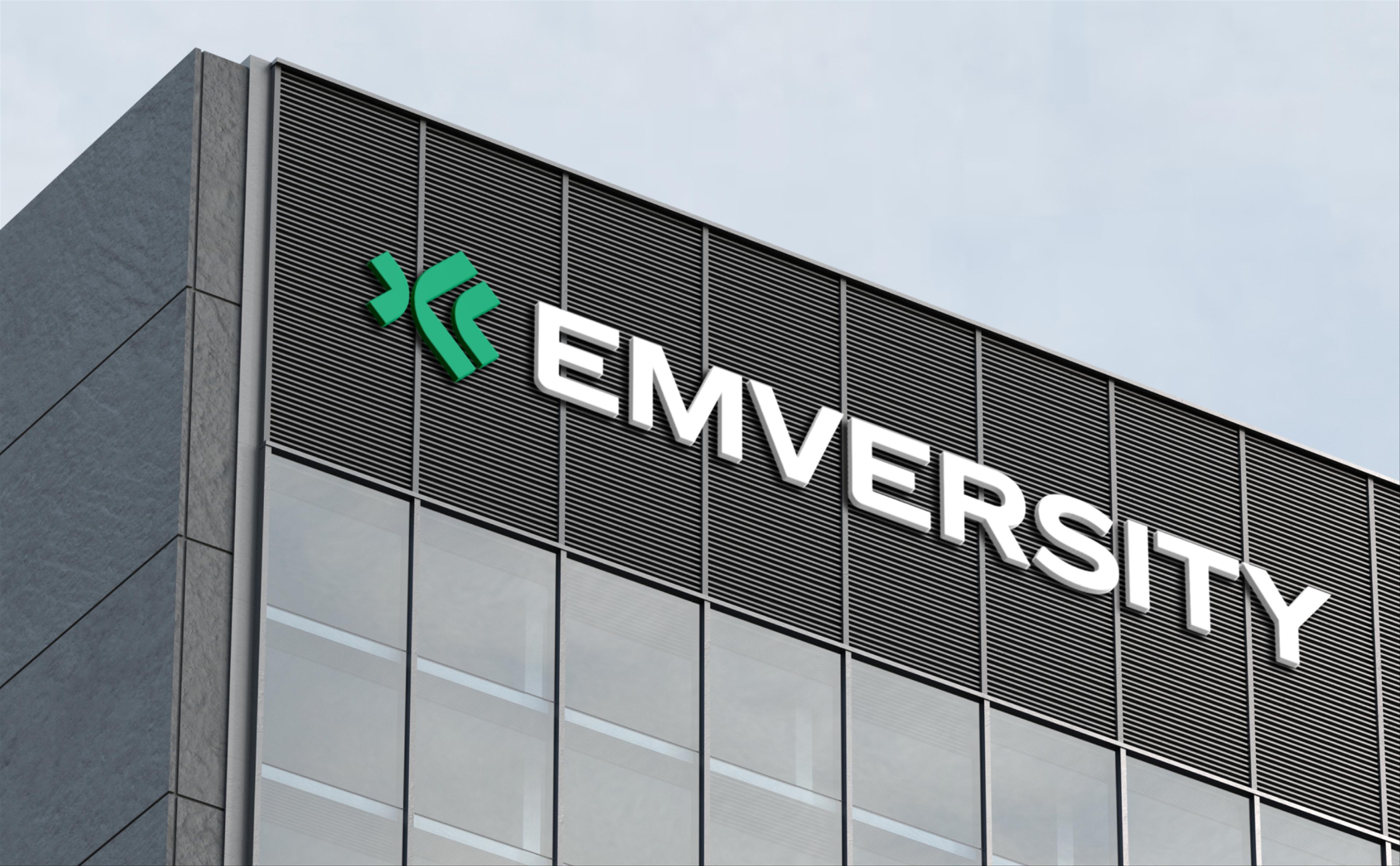
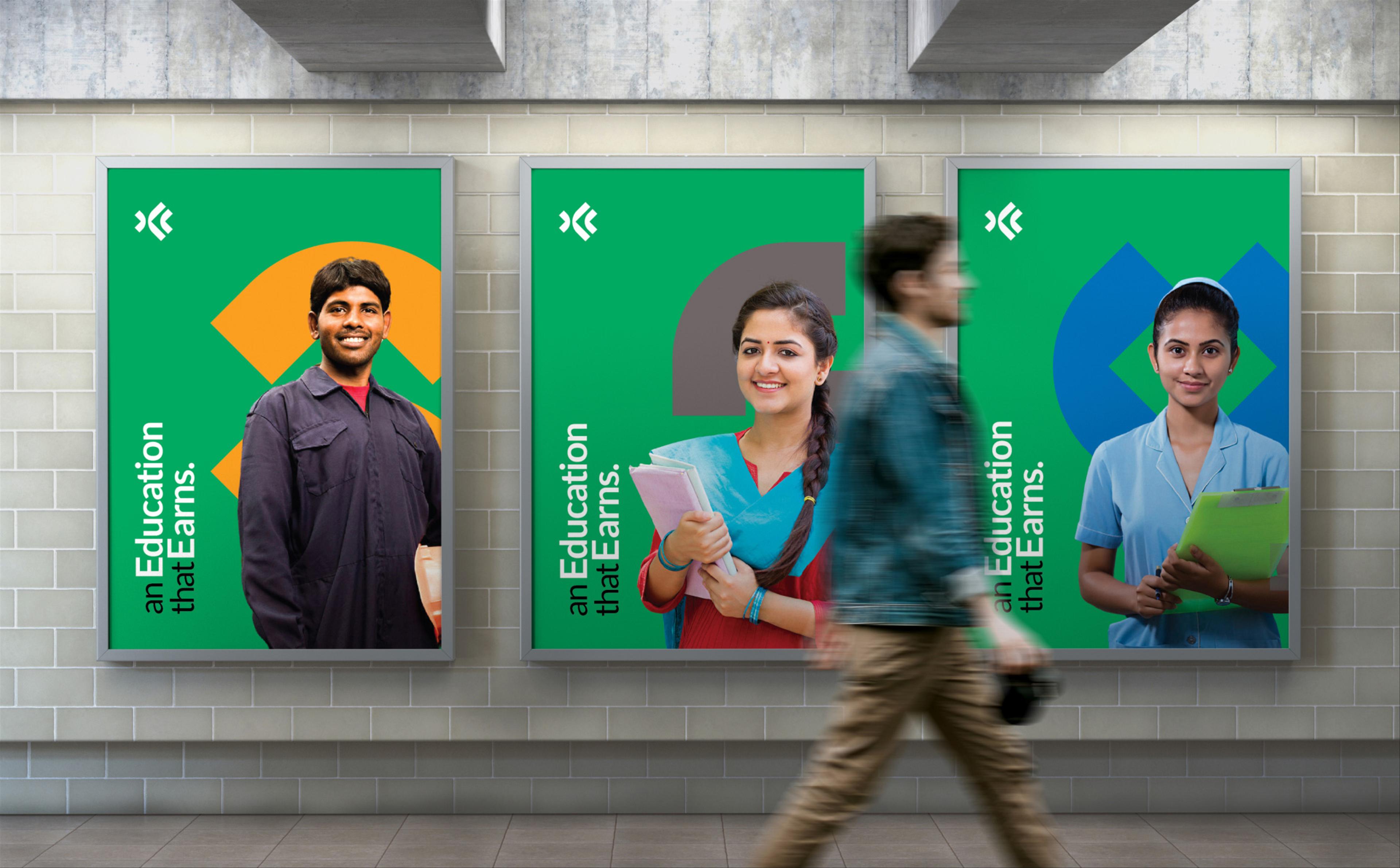
The position built outward from that. Emversity, built from Em (employment, empowerment, empathy) fused with versity (university), named a hybrid nobody else in the category had claimed. The essence resolved into ROI: Return on Investment, the tangible outcome expected; Respect on Investment, the dignity restored to a stigmatised path; Responsibility on Investment, the accountability owed to the promise. Positioned externally as An Education that Earns, the language borrowed the vocabulary of finance over academia, matching how every stakeholder was already measuring the decision, and giving Emversity a claim no competing institute could match: a return, not a certificate, was the actual product.
The visual identity carried the logic forward. The logomark, The Ripple, uses three boomerangs to render a single decision returning value well beyond the individual who made it. Bluish-green signalled learning and growth, offset by black for financial seriousness, while a modified sans-serif typeface kept the tone approachable rather than institutional, with each school carrying its own colour variant inside one shared system
The scope ran from research and brand essence through naming and verbal identity to the visual system and brand world above.


Launched globally in January 2026 across digital and physical touchpoints.
Other Projects


All Work
BFSI
SK Finance
Shop Se
Embarq
SKP Group
Quadria Capital
Ratnaafin
Consulting
Levers for Change
Ozemio
Sila
Observeye
Engineering & Manufacturing
GMM Pfaudler
Precision Electricals
Evonith
Precision Pipes & Fittings
Pressfit
Norsmiths
Alok Textiles
Lloyds Metals
Healthcare
Helmier
Accu-chekAlembic Altris HD
Sabka Dentist
Oryza
Gumazing
VE Enterprises
Vishwaraj Hospital
IT & Technology
Uneecops
Infinichains
Coserve
Ridlr (Ola)
Zest
Logistics
Construction & Real Estate
Bharat Realty
Mehta Group
Om Landmarc
Rachanaa Group
Beautex
Royalti
Education
FLAME University
Vidyashilp University
The Academic City
Dr Polaris
K. K. Wagh Education Society
IRMRI
Birla International Schools
Shloka
Tenneo
Atoot
MIT World Peace School
Raisoni