Norsmiths
Brand Purpose and Positioning
Brand Strategy
Brand and Business Alignment
Brand Naming
Verbal Identity
Visual Identity
Brand Communication
Launch Strategy
UI-UX
Spatial Branding
Energising Canadian Mining by Empowering Communities
The Challenge
In the mining town of Kirkland Lake, Ontario, Canada, a revolutionary mining solutions company emerged, leading the way in state-of-the-art drill bit reconditioning services and innovative problem-solving solutions. This pioneering initiative was founded to address a significant void in the local mining industry by delivering essential services that were once outsourced to distant shores in China and Germany.
ABND was engaged as a strategic partner to collaboratively craft a distinctive brand that not only embodied the company's commitment to excellence but also cultivated a lasting impression within the community. The challenge at hand involved positioning this unprecedented enterprise as the premier destination for essential mining services, eliminating the necessity for local mines, mining contractors, and drilling companies to seek cutting-edge solutions beyond a 200-kilometre radius. The objective was not merely to meet but to exceed the standards set by international counterparts, introducing convenience and efficiency to the core of Kirkland Lake's mining operations.
Our Approach
ABND undertook both Primary and Secondary research to comprehend the audience, trends, and competitive landscape, aiming to devise effective strategies for positioning and differentiation.
Primary Research:
- Initiation and Alignment Meeting - with members of the mining community to understand the challenges, lifestyle, and socio-economic variables.
- Leadership Interaction - Engaging with key stakeholders and leadership to gain insights into the brand's vision and objectives.
- Brand Modeling - Initiatives focused on discerning the fundamental aspects of the business to guide branding decisions.
Secondary Research:
- Comprehensive analysis of current communication channels and product literature within the category to extract insights and discern best practices.
- Methodical exploration to recognise emerging trends and patterns in the industry, ensuring a visionary approach.
The Solution
By conducting immersive interviews and engaging in meaningful interactions with the community, complemented by insightful leadership discussions, ABND adeptly formulated a compelling brand essence that organically surfaced and aligned seamlessly with Norsmiths' fundamental mission.
"Of the Miners. For the Miners. By the Miners."
Of the Miners - Nestled in the heart of Canada's thriving mining community, Norsmiths stands as a torchbearer, providing employment and opportunities to the families integral to the mining industry.
For the Miners - Exclusively dedicated to miners, Norsmiths ensures they have immediate access to essential process solutions. No longer dependent on external agencies or international corporations, miners can now find all their necessities within the embrace of our company.
By the Miners - The entire Norsmiths team comprises of former miners and seasoned professionals in the mining industry. With an intrinsic passion for mining, the team is deeply immersed in the industry, uniquely positioning themselves to intimately comprehend and address the challenges encountered by the mining community. Who better to tackle these challenges than those who have traversed the mines themselves?
Brand Name
The name 'Norsmiths' artistically combines 'north' and 'smiths,' not only reflecting the company's geographic location in northern Ontario but also symbolising its unwavering commitment to expansive growth, reaching into neighbouring cities and countries. The term 'smith' traditionally signifies specialisation, often associated with skilled professionals such as goldsmiths or blacksmiths. In the context of Norsmiths, it accentuates their expertise as specialists in the mining industry in Kirkland. The selection of 'Norsmiths' presents a plethora of advantages. It's an unambiguous, memorable, and potent name that seamlessly aligns with the company's vision for future expansion.
Brand Identity & Typography
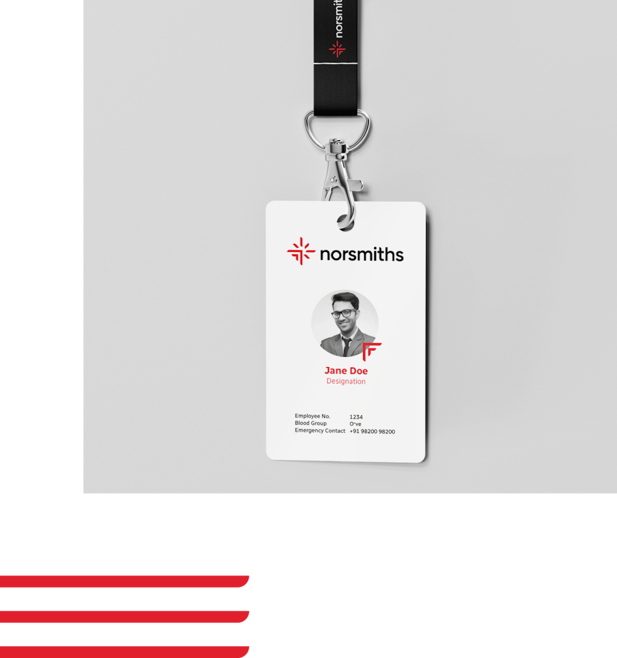
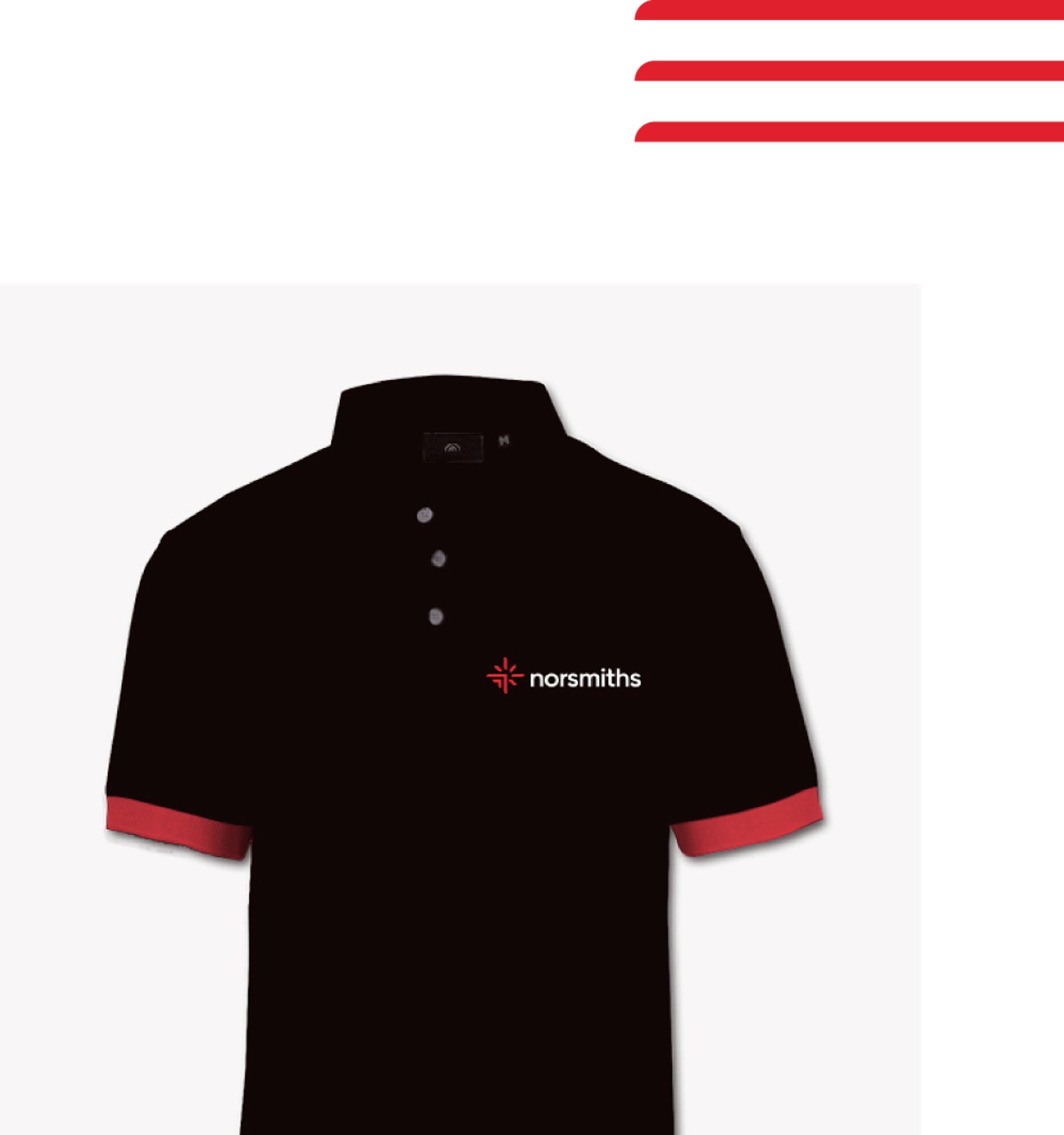
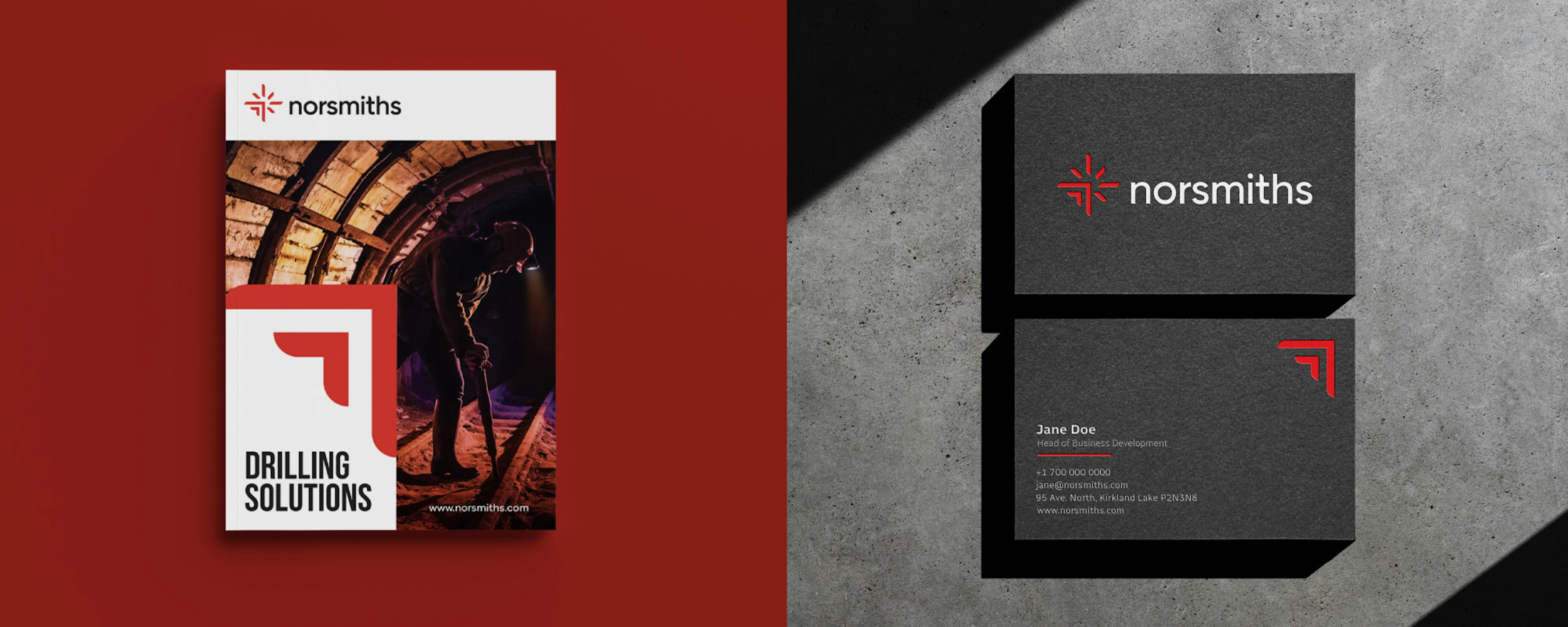
The logo encapsulates the idea that small sparks possess the potential to initiate significant transformation. It features an upward arrow adorned with sparks, symbolising progress and innovation. The incorporation of a vibrant red hue not only reflects Kirkland Lake's passionate spirit but also pays homage to the region's rich mining heritage. The typeface was meticulously crafted and designed to complement the logo seamlessly.
Impact
Norsmiths' triumphant branding not only garnered acclaim within the local mining community but also drew government investments, validating the efficiency of the brand strategy and identity in aligning with the company’s vision and the community’s requirements.


Other Projects
All Work
BFSI
SK Finance
Shop Se
Embarq
SKP Group
Quadria Capital
Ratnaafin
Consulting
Levers for Change
Ozemio
Sila
Observeye
Engineering & Manufacturing
GMM Pfaudler
Precision Electricals
Evonith
Precision Pipes & Fittings
Pressfit
Norsmiths
Alok Textiles
Lloyds Metals
Healthcare
Helmier
Accu-chekAlembic Altris HD
Sabka Dentist
Oryza
Gumazing
VE Enterprises
Vishwaraj Hospital
IT & Technology
Uneecops
Infinichains
Coserve
Ridlr (Ola)
Zest
Logistics
Construction & Real Estate
Bharat Realty
Mehta Group
Om Landmarc
Rachanaa Group
Beautex
Royalti
Education
FLAME University
Vidyashilp University
The Academic City
Dr Polaris
K. K. Wagh Education Society
IRMRI
Birla International Schools
Shloka
Tenneo
Atoot
MIT World Peace School
Raisoni


