Precision Electricals
Brand Audit
Strategic Research and Insighting
Brand Purpose and Positioning
Brand Strategy
Brand and Business Alignment
Brand Architecture
Verbal Identity
Visual Identity
Brand Communication
Launch Strategy
UI-UX
Packaging
Elevating Smart Living with Cutting-Edge Electrical Solutions
The Challenge
Precision Electricals, a distinguished electrical brand with a legacy spanning three decades, encountered a unique challenge. Despite a robust presence in the market, the brand faced a noticeable gap in awareness among end consumers. While boasting multiple well-established product lines, including switches, MCBs, and various electrical accessories, the company struggled to seamlessly integrate these individual brands into a cohesive group Brand Identity. With business expansion and product diversification, it became evident that a distinct and unified brand was imperative.
Approach
In the process of rebranding Precision Electricals, ABND embraced a thorough research-driven methodology to tackle the prevailing challenge, employing a blend of both primary and secondary research methods:
- In the pursuit of insights and to identify strengths and weaknesses, ABND facilitated immersion sessions with both- internal and external stakeholders.
- A comprehensive retail study ensued, encompassing visits to identified retailers, dealers, distributors, and electricians, along with interviews with end users to comprehend the brand's existing position.
- In addition, a competition review, analysing the communication, packaging, and strategy employed by rival brands was conducted.
- To further enrich understanding, ABND orchestrated roundtable discussions with electrical industry veterans. This provided valuable insights into the brand's current standing, future potential, and a profound understanding of the industry landscape.
The Solution
Redefining the Challenge:
ABND thoroughly identified and rectified crucial gaps for Precision Electricals, addressing issues ranging from awareness to communication.
- The brand encountered a distinctive challenge in the B2B segment, where the name "Precision" clashed with another prominent entity specialising in pipes and fittings, resulting in confusion among stakeholders.
- Compounding this issue, the existing product architecture lacked transparent associations between product range names and the overarching parent brand. While the individual products had developed their individual brand equity over time, this success had not translated into bolstering the group brand equity.
- Moreover, the brand faced hurdles in introducing new electrical products, hampered by a low parent brand equity.
Brand Positioning & Strategy
ABND acknowledged the essential task of crafting a brand deeply attuned to the social and familial aspirations of Precision Electricals' target audience. Centred on intelligent product offerings, supported by robust in-house manufacturing and testing capabilities, Precision’s pragmatic clientele is distinguished by ambition and practicality, actively seeking quality, durability, aesthetics, and a comprehensive value proposition with superior customer service.
Precision, as a brand, stands out in presenting intricately designed products. In synchronisation with the progression of contemporary homes and the domination of 'smart homes,' the brand encapsulates the essence of SMART, representing Safety, Modernity, Affordability, Reliability, and Technological Advancement.
At the heart of Precision Electricals lies an unwavering dedication to precision, apparent from the design of products to rigorous quality assessments. The brand's trustworthiness is established on attention to detail and subjecting all products to tests that exceed industry standards, thereby establishing new benchmarks.
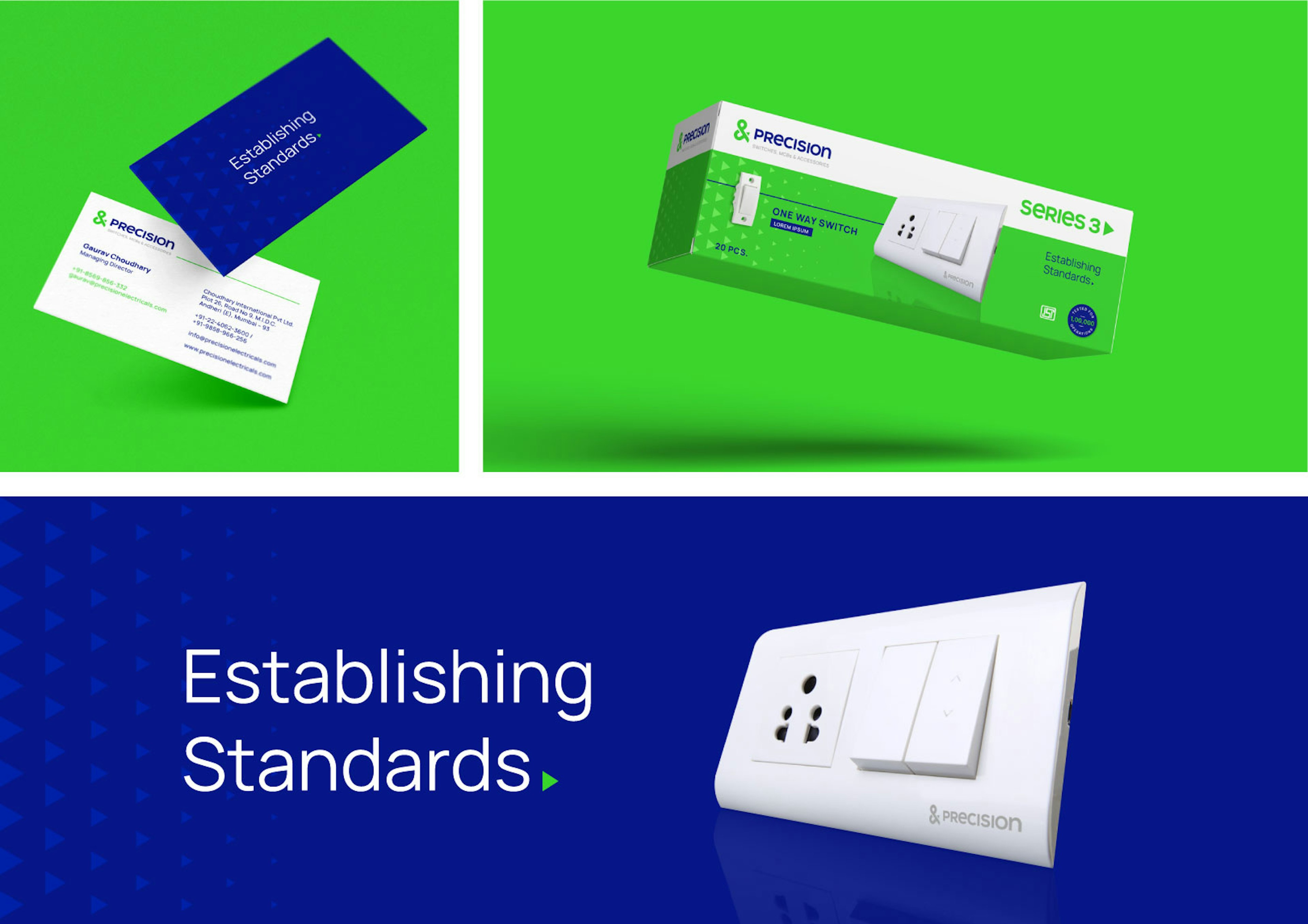
The core ethos of Precision Electricals is embodied in the expression: "Establishing Standards." This signifies not merely meeting expectations but charting a course that reshapes norms and elevates the standard in the electrical industry. Such a dedication positions Precision as a pioneer, establishing new benchmarks and fortifying its position as an industry leader.
Brand Identity
Visual Identity:
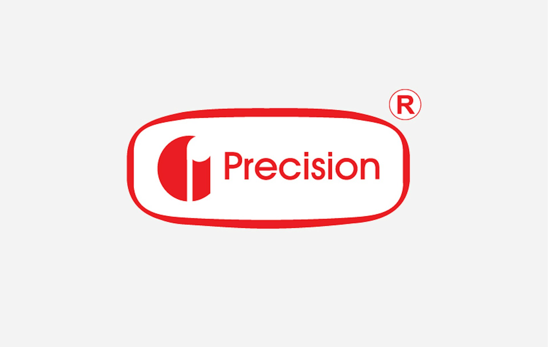
In the process of redefining Precision Electrical's identity, ABND identified the necessity for a contemporary and refined image. The existing identity no longer resonated with the target audience and the new brand positioning, leading to the creation of a fresh logo with a minimalist and timeless aesthetic. The introduction of the ampersand symbol, symbolising the brand's dedication to going "Beyond" and delivering "Much More," brought depth to the logo. The inclusion of the infinity symbol underscored the enduring quality of the brand, aligning seamlessly with its modern design philosophy. The overarching objective was to position Precision Electrical as a master brand, exuding energy, universal appeal, and a reliable presence in the market.
Brand Colors & Logotype:
The revamped strategy necessitated a departure from the prevalent "red brand" motif in the electrical sector, as red, though conventional, failed to embody the brand's fundamental values of quality, innovation, technology, and sophistication.
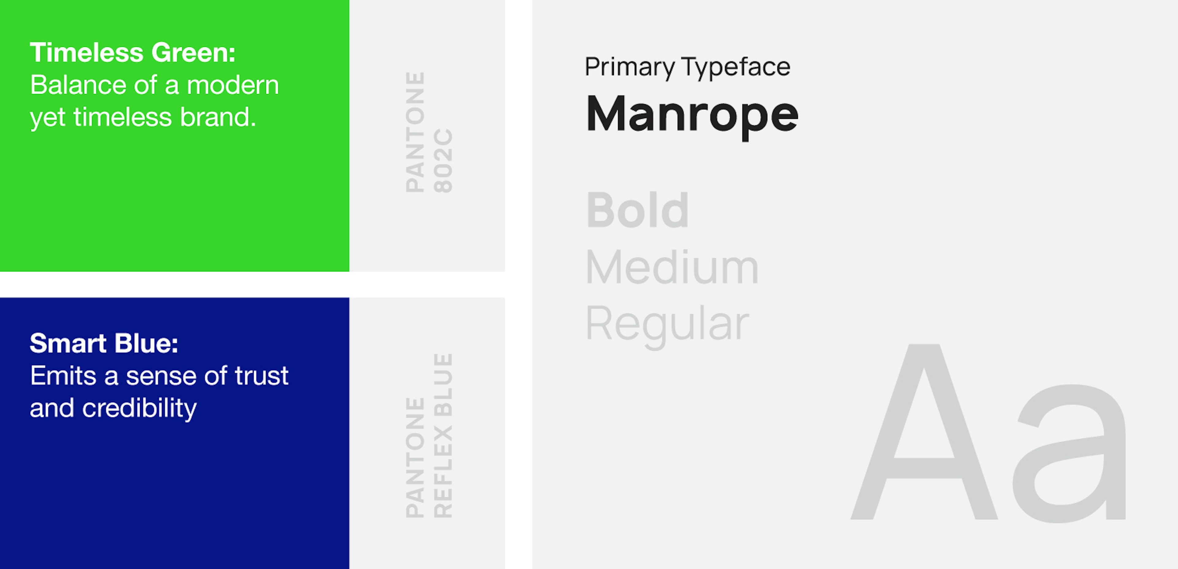
ABND astutely adopted a colour palette featuring 'Timeless Green' and 'Contemporary Blue' to reimagine the visual identity of Precision Electrical. 'Timeless Green' conveys the nuanced balance between growth and stability, appealing to pragmatic decision-makers. In contrast, 'Contemporary Blue' personifies the Creator brand persona – exuding youthfulness, credibility, and trustworthiness.
In alignment with these distinctive hues, ABND meticulously designed a tailored typography that integrates seamlessly with the brand's identity. This deliberate fusion of unique colours and fonts guarantees that Precision Electrical distinguishes itself in the market with an innovative and captivating visual language.
Brand Architecture
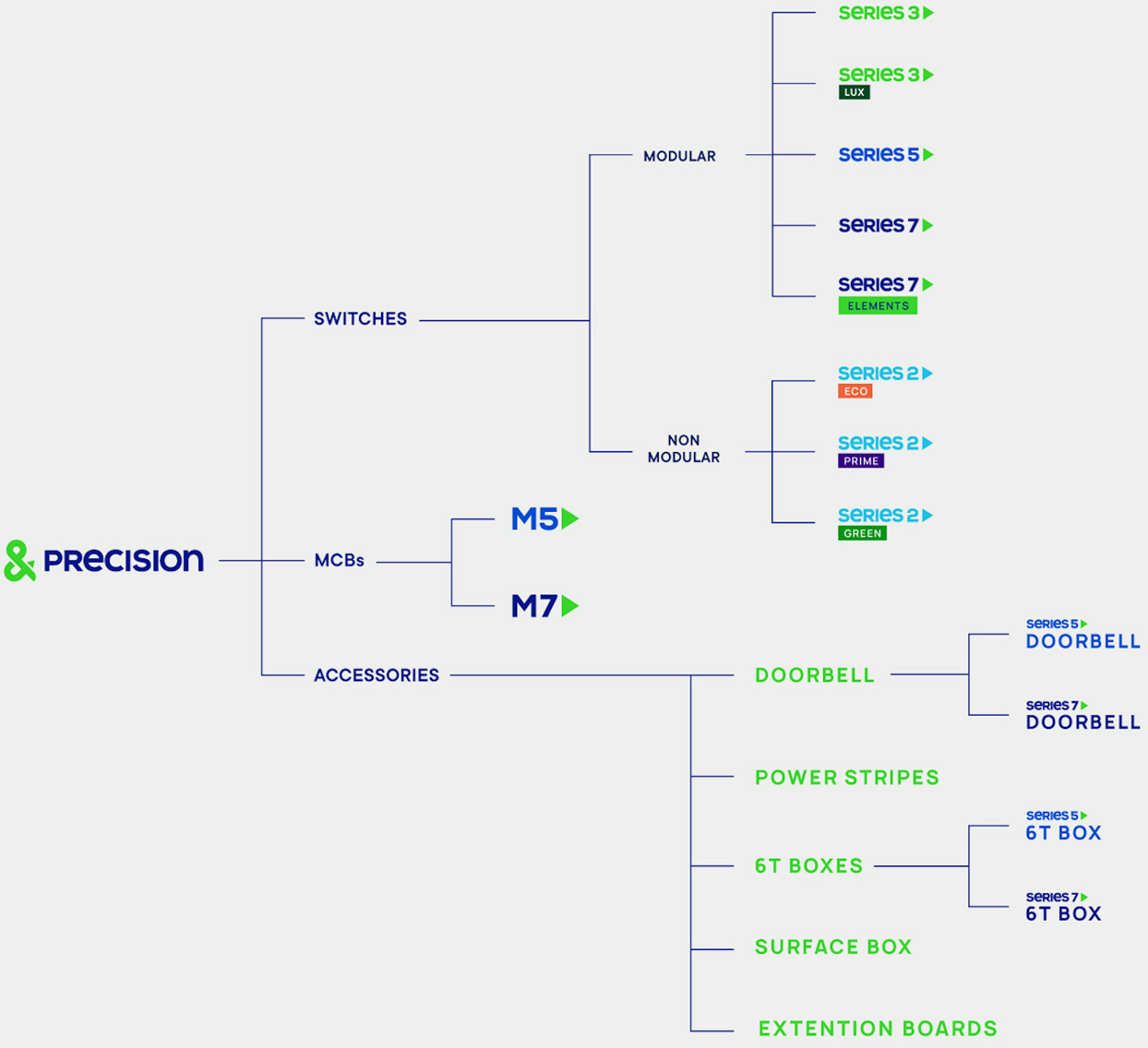
The revised strategy demanded the establishment of a resilient collective brand identity. To attain this objective, a conscious choice was made to abandon all pre-existing product brand names associated with Precision. Instead, a novel nomenclature system was formulated, guaranteeing not only a unified group brand identity but also introducing a level of differentiation and coherence.
We systematically classified all products considering their unique attributes, pricing approaches, and target audiences. Switches, MCBs, and electrical accessories were carefully grouped according to these criteria. Each category received a numerical designation, subsequently serving as the nomenclature for the product category (e.g., Series 5). The individual products within each category were then named in direct correlation with the assigned series (e.g., Series 5 Doorbell).
To enhance systematic organisation, we assigned odd numbers to prominent consumer-oriented brands, reserving even numbers for B2B project-centric brands. Each series adopted a distinct colour, seamlessly incorporating it into the overarching group brand colour scheme. This strategic methodology not only facilitated clear differentiation but also ensured a unified visual identity across the comprehensive product range.







Other Projects
All Work
BFSI
SK Finance
Shop Se
Embarq
SKP Group
Quadria Capital
Ratnaafin
Consulting
Levers for Change
Ozemio
Sila
Observeye
Engineering & Manufacturing
GMM Pfaudler
Precision Electricals
Evonith
Precision Pipes & Fittings
Pressfit
Norsmiths
Alok Textiles
Lloyds Metals
Healthcare
Helmier
Accu-chekAlembic Altris HD
Sabka Dentist
Oryza
Gumazing
VE Enterprises
Vishwaraj Hospital
IT & Technology
Uneecops
Infinichains
Coserve
Ridlr (Ola)
Zest
Logistics
Construction & Real Estate
Bharat Realty
Mehta Group
Om Landmarc
Rachanaa Group
Beautex
Royalti
Education
FLAME University
Vidyashilp University
The Academic City
Dr Polaris
K. K. Wagh Education Society
IRMRI
Birla International Schools
Shloka
Tenneo
Atoot
MIT World Peace School
Raisoni


